
As some of you may have seen by now, we’ve launched a fantastic new look and feel for our Dashboards. From top to bottom, we’ve added more unicorns, rainbows and cat-meme-powered visualizations. The end result? We hope you’ll agree: it’s a breath of fresh air that brings a bit more power to your analytics inside Sumo Logic.
Do you find yourself accidentally moving Panels around, when all you wanted to do was look at your Dashboard? Worry no more. We have introduce a clear Edit mode that simplifies the whole process of making your Dashboard look perfect.
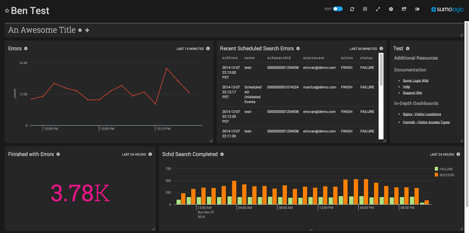
With the new Edit mode, you can now unleash your creative side, and move and resize panels on your dashboard. You can make one panel take up most of the screen and surround it with smaller panels. Mix and match big Panels and small until you get the perfect balance of DevOps goodness (it’s also great feng shui). And for those of you that want that that edgy, uber-geek look – meet our new Light and Dark themes. Use the gear icon and select the menu item Toggle Theme to switch over to this great new option, pick your side, and may the force be with you.
Over the years as we’ve gathered feedback, we kept hearing over and over how much teams wanted to be able to add simple blobs of text next to their charts. For some, this was a matter of providing really important references to SOPs and other important-sounding documents. For others, they really just needed a note to “Sound all the alarms and pray to your various gods if this ever goes above 17.8756”. You get the idea – a little extra context makes all the difference – and now you can put that right in your Dashboards! Just click the Add Panel button while in Edit mode,you can add a Panel just for title text or a text blog. And did you want icing on this cake? Markdown. That’s right – you’re just a few dozen asterisks away from the perfect nested list.
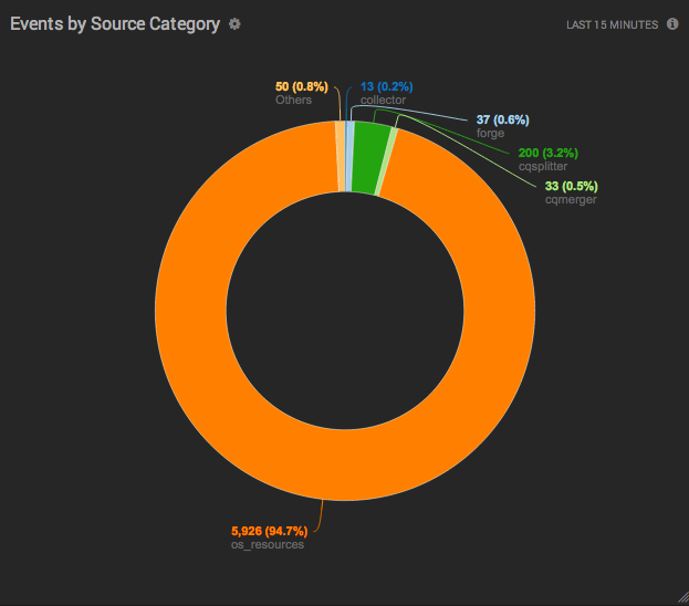
We also took some time to brush up some of our favorite chart types. Been wishing for an easier to read Single Value Monitor? Done. Ever wished your pie charts look cooler? Well, we added Donut charts to spice things up.
Our guys in the apps department couldn’t wait to get their hands on this.. Since we all know and love AWS and the essential functionality that our AWS apps provide, we decided that those were a great place to start with a bit of a refresh as well. These apps now feature a more uniform Overview dashboard and better visualizations for key data points, and they also look pretty cool.
So what do you think of the new Dashboards and AWS apps? Love it or hate it – let us know!


